THE THINGS A CITY THROWS AWAY
Four months of collecting dispatch notes, counterfoils and unfilled forms — and what makes bureaucratic design so hard to fake.
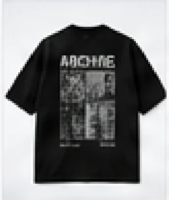
DROP 002 — PUBLIC RECORD — BACK PRINT ARTWORKSTAMPED CLEARANCE
Nobody designs a weighbridge slip to be looked at. That is exactly why it is worth looking at. Every element on it exists because a process required it, and the result is a kind of composition that no designer would arrive at deliberately.
THE TELL IS ALWAYS THE SPACING
Fake documents fail on rhythm. A designer building a receipt from imagination will space the fields evenly, because even spacing looks correct. Real forms do not do this. Fields cluster where a machine needed them and leave dead space where a later revision removed something nobody replaced.
The second tell is the type mixing. A real document will carry three or four unrelated faces — one from the pre-printed stock, one from the impact printer, one from a rubber stamp, one handwritten. They do not harmonise, and the disharmony is load-bearing.
WHAT WE COLLECTED
- 01Dispatch notes, triplicate, 14 examples
- 02Weighbridge slips, 6 examples, all between 01:00 and 04:00
- 03Municipal forms, unfilled, 9 examples
- 04Counterfoils with torn perforation edges, 22 examples
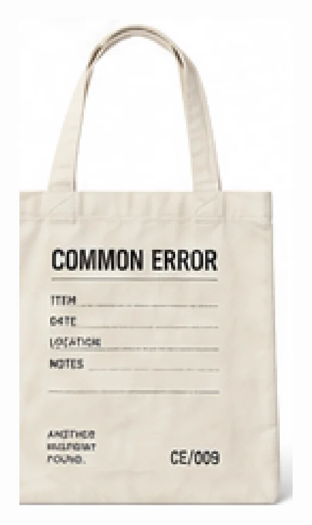
Every identifying field was left blank or removed before scanning. The drop reproduces the structure of these documents, never their contents. There is no real name, address or reference number anywhere in DROP 002.
We kept the empty box for a reference number. It is the most honest thing on the garment.
WHERE THIS SHOWS UP
ALL PIECES →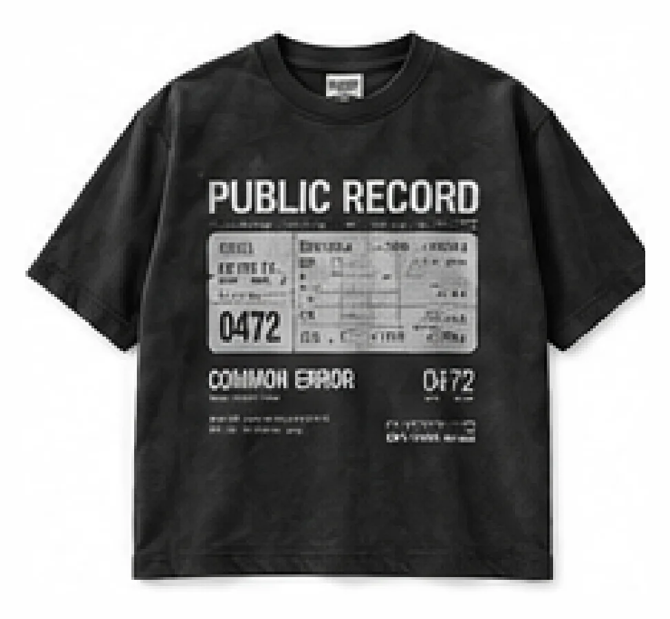
PUBLIC RECORD TEE