FOUR PRINT METHODS, FOUR REASONS
Screen, high-density, puff and discharge. Each one changes what the artwork is, not just how it looks.
A print technique is a material decision, not a finish. Choosing puff because a website needs a word to put in a spec list produces exactly the garment you would expect. Choosing it because the artwork is about light falling on a surface produces something else.
SCREEN — CE / 001
Four passes at 55 lpi, printed wet-on-wet. The dots break unevenly across the weave because each pass lands on ink that has not fully set. A signal degrades rather than stops, and this is what that looks like in ink.
HIGH-DENSITY — CE / 002
1.4mm of raised ink with a hard shoulder. It gives a printed block the physical authority of a rubber stamp — you can feel the edge exactly where the stamp would have landed. Used only on the clearance box, never on type.
PUFF — CE / 004
1.2mm elevation, applied to the light cone only. The shutter beneath it stays flat. Under a raking lamp the graphic behaves the way the original scene did, which is the entire justification for using it.
DISCHARGE — CE / 003
Discharge removes dye rather than adding ink, so the route diagram has no hand at all. It reads as part of the cloth. For a graphic that is pretending to be official signage, having no surface is the correct answer.
Use the technique because it serves the artwork, not because a spec sheet needs a buzzword.
WHERE THIS SHOWS UP
ALL PIECES →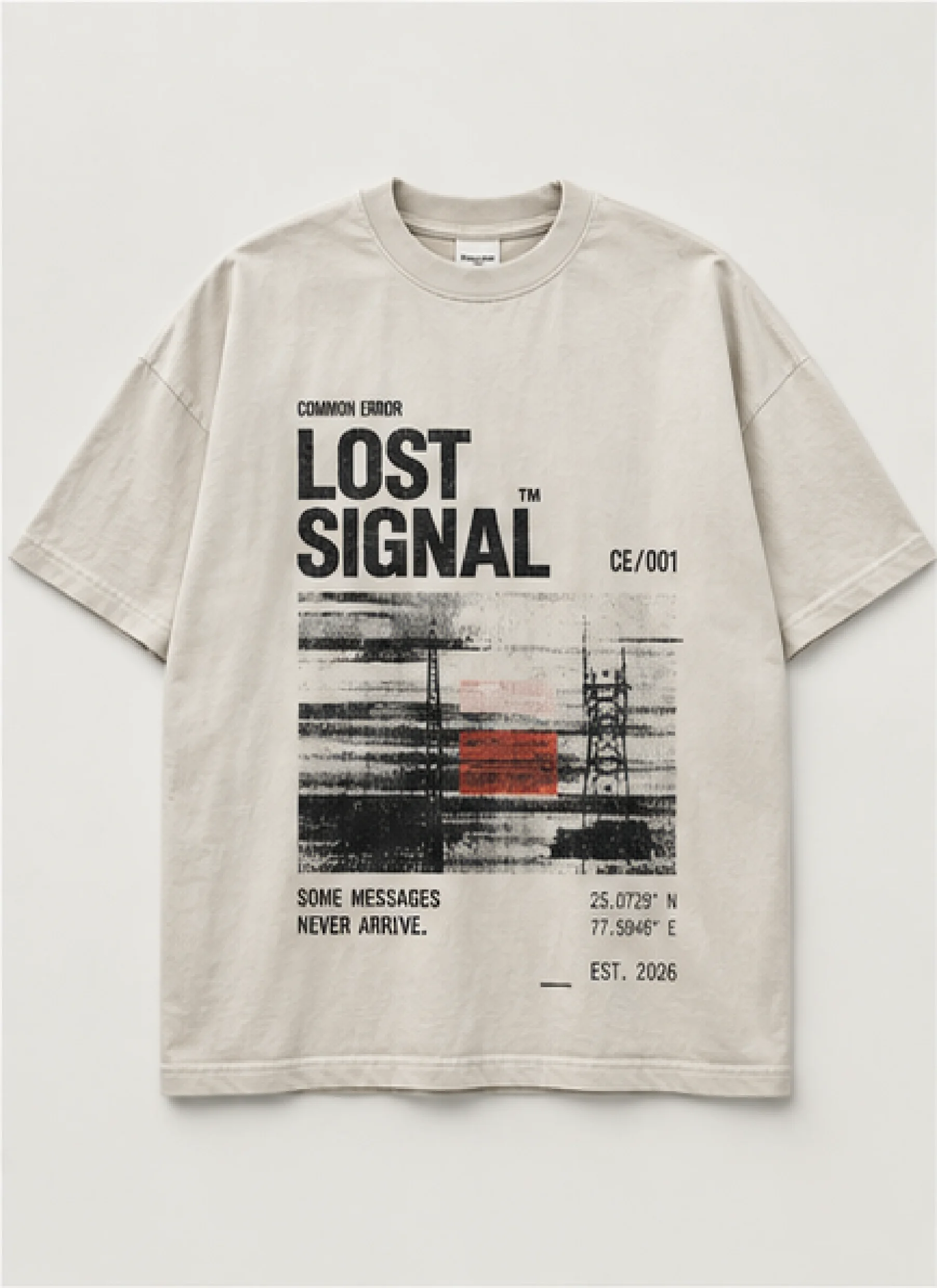
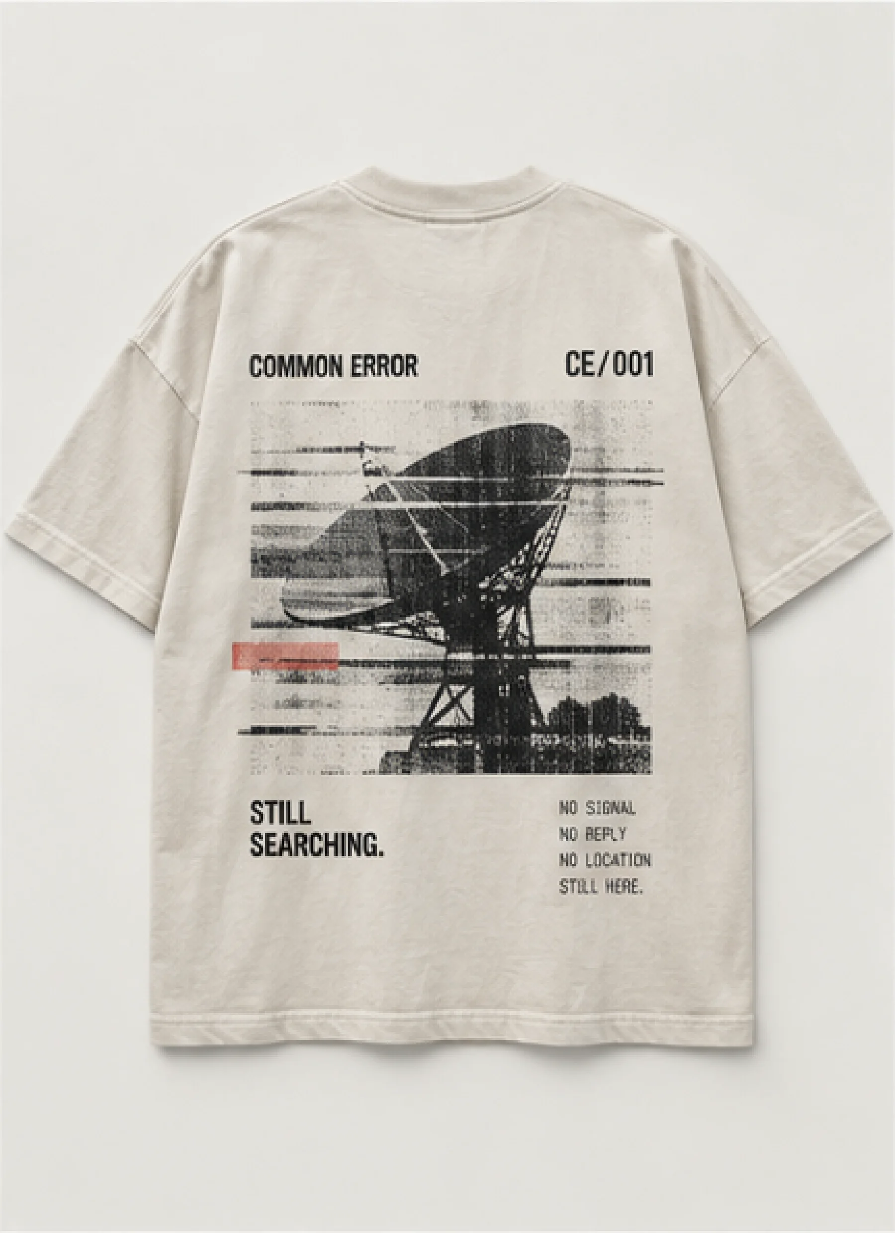
LOST SIGNAL TEE